Nemo: Autonomous Driving Scenario Search & Analysis
Lead Product Designer
Project Summary
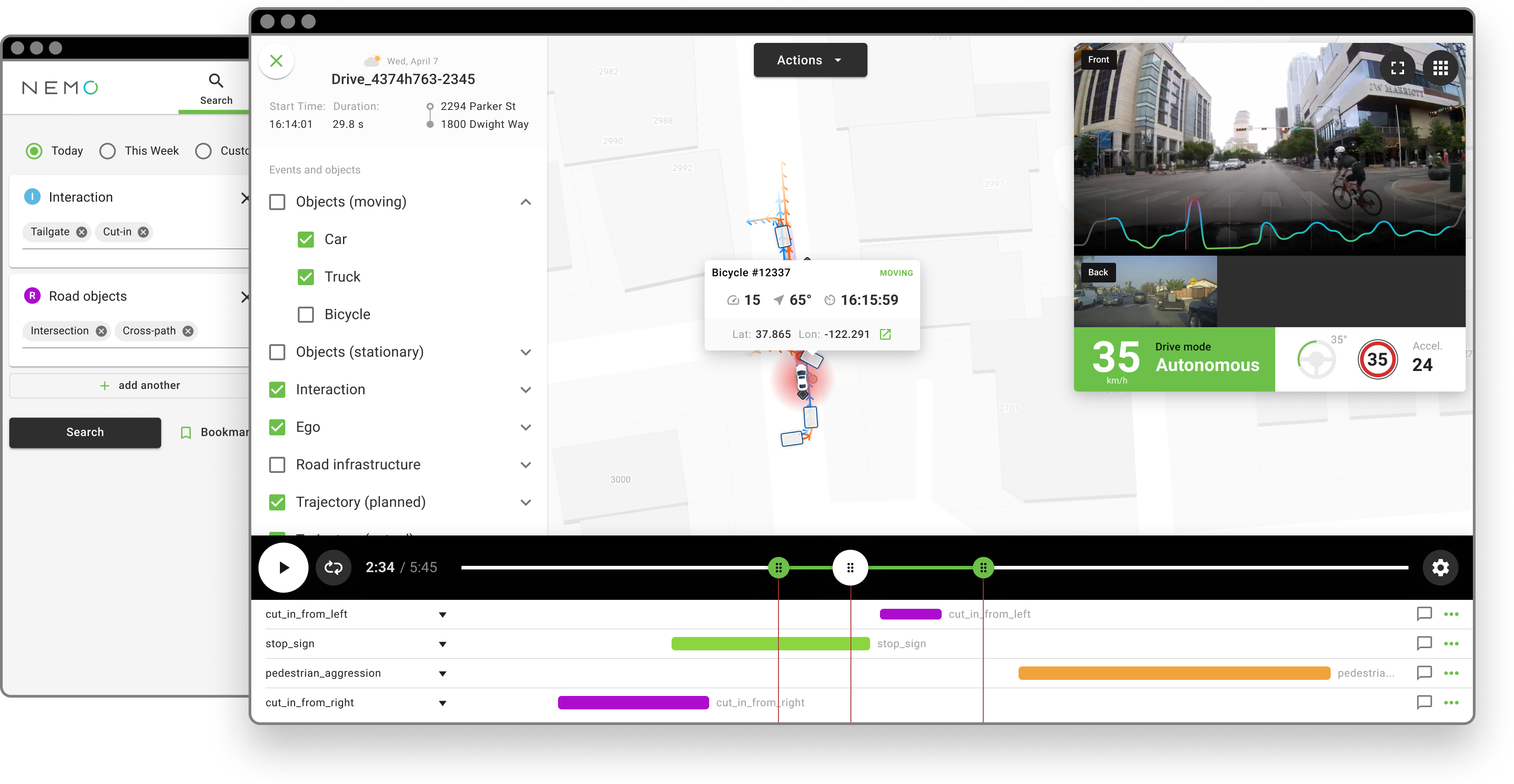
Nemo is an engine and an interface for finding valuable events and traffic scenarios from driving logs. The interface allows engineers to export scenarios for algorithm training, product testing, annotation, or simulation.
Applied Skills
Interaction Design, UI Design, User Research, Rapid Prototyping, Usability Testing, Figma, ProtoPie, Branding
Quality and relevance of autonomous driving data
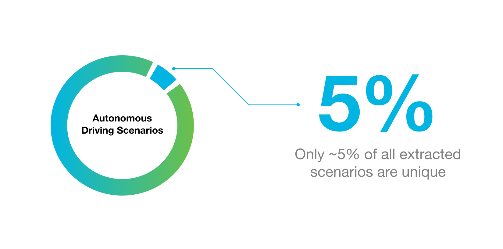
In the early stages of self-driving systems development, it was believed that collecting large amounts of data was the key to achieving full autonomy (a vehicle that is capable of operating itself in an uncontrolled environment without the safety of a driver). But the Nemo team at Ridecell recognized that it is also the quality and relevance of the data that improves the performance of self-driving systems.
What is Nemo?
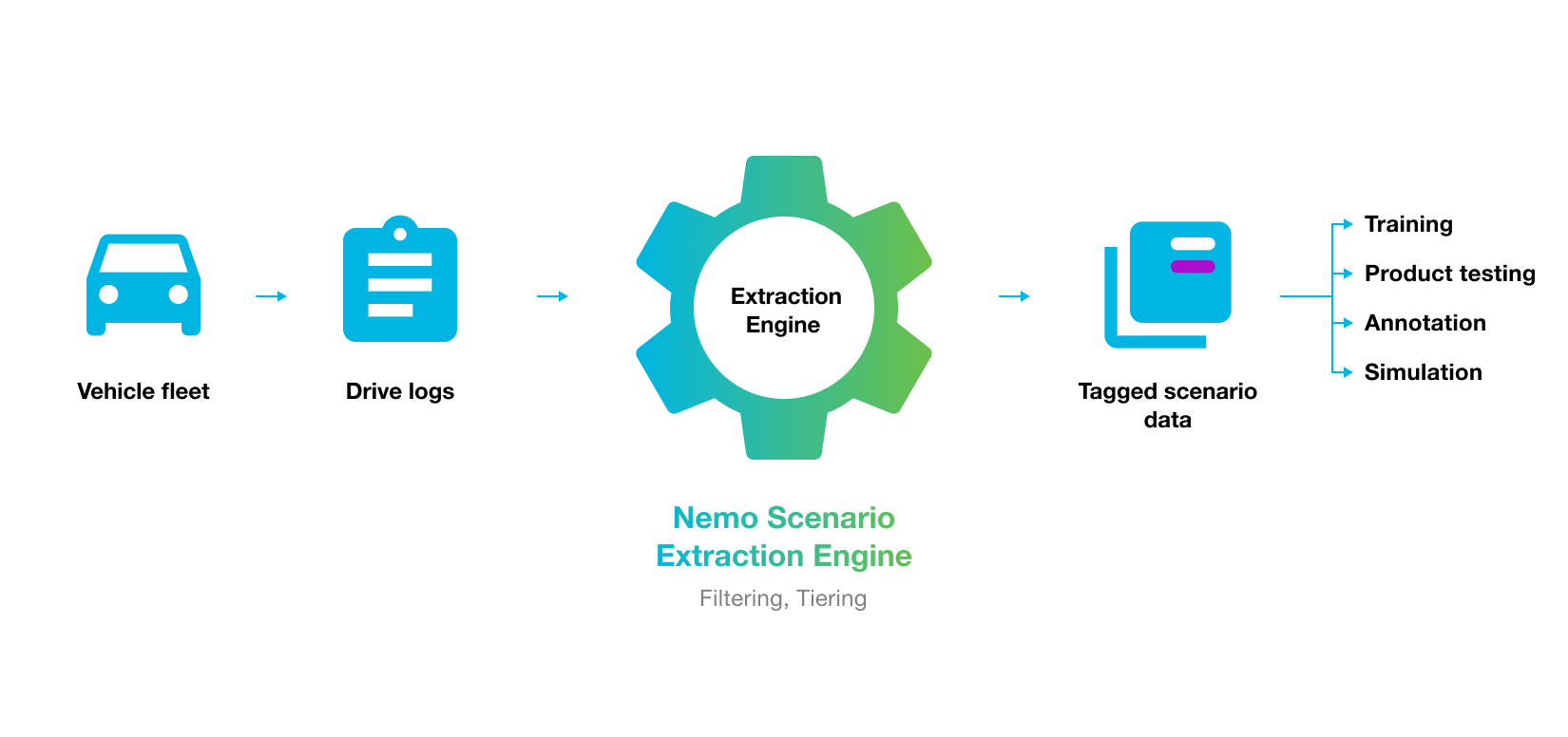
The challenge of finding truly useful data is what inspired the idea of Nemo. The service was envisioned as a toolset for engineers to find and extract unique scenarios and edge cases that can then be used as a training set. The Nemo system ingested and analyzed the vehicle’s data to construct a detailed description, i.e., metadata, of the environment, objects, and interactions the vehicle encountered on a drive. This preprocessing gave engineers and researchers the ability to query, explore, and extract interesting relationships as scenario data.
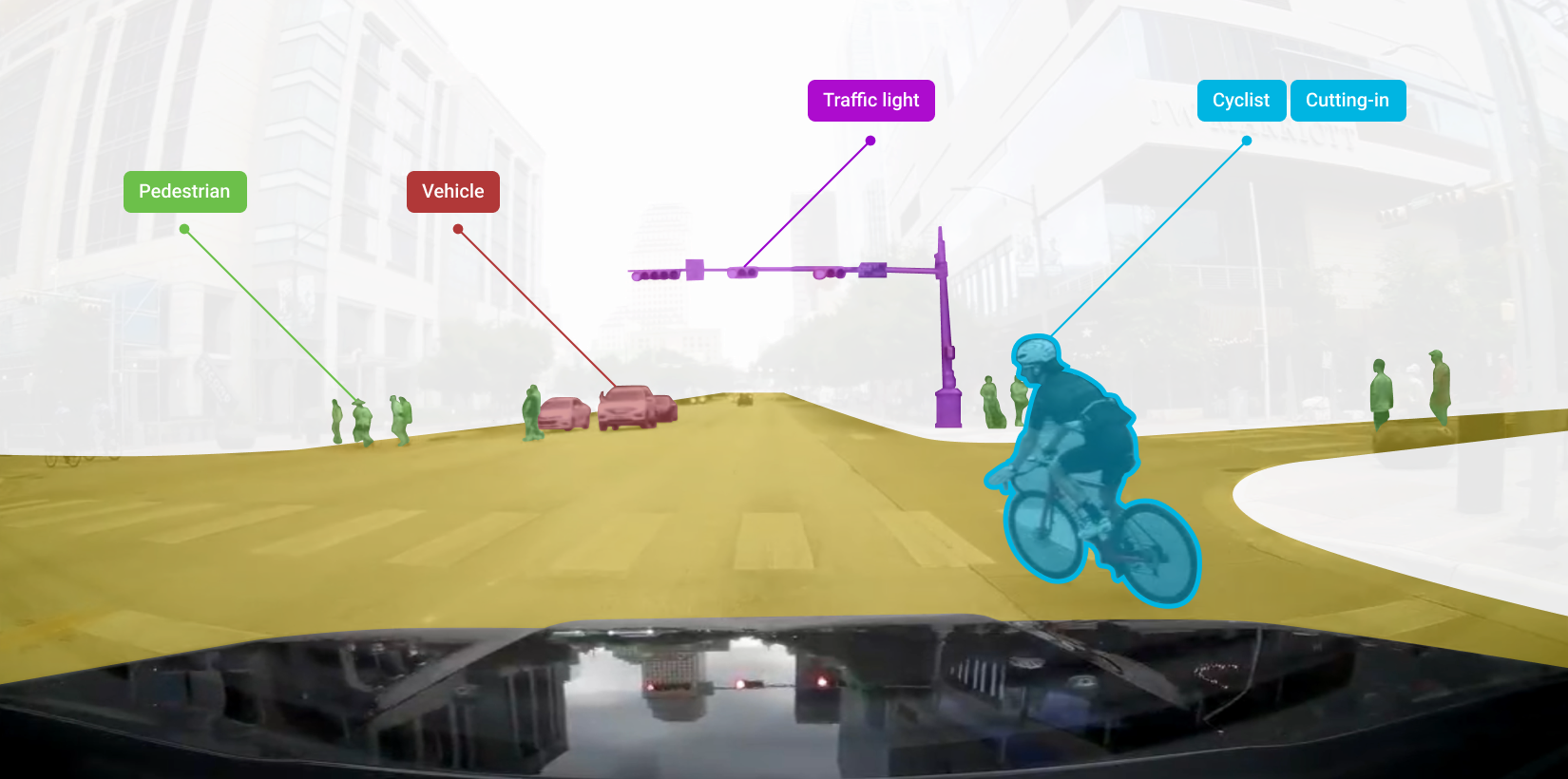
For example, a researcher could use Nemo to find any of the instances where a cyclist cut into the path of the autonomous vehicle (AV). The researcher could then analyze each instance for causes. If the vehicle’s perception system failed to recognize the cyclist’s behavior, the researcher could annotate it and train the system on perceiving that scenario better in future instances.
Motion planning and perception engineers
As I began working with the Nemo team, I identified two main user profiles through facilitation of stakeholder interviews – motion planning and perception engineers. Motion planning engineers developed the control systems that navigate the AV in the given environment. Perception system engineers developed the vehicle’s perception system (camera, lidar sensors, and perception software) that serves as the AV’s eyes on the road - it recognizes and classifies nearby objects and events.
Both types of engineers spent a significant amount of time manually reviewing the drive logs to find interesting and unusual scenarios. This could become really inefficient as vehicles in a fleet begin to multiply and sensor data grows exponentially. Nemo addressed this challenge through its proprietary data processing and query engine. My goal was to make the query engine accessible to a wide pool of engineers and analysts through a user interface (UI) that makes searching, understanding, and taking action on the data very easy.
Block search pattern
I designed a block search pattern that made the searching experience both easy and scalable. A block was built when the user specified a search category or a specific tag, which could be an action or an object. After a block was created, the user could add multiple tags of that category. This also served the secondary function of informing the user of the underlying structure of the data which led to more informed search queries and analysis.
The block pattern also allowed for scalability - there was no limitation to the number of categories and corresponding tags. The categories and tags could also be tailored to the needs of the individual companies that would use the service.
Efficient browsing through the Side Panel
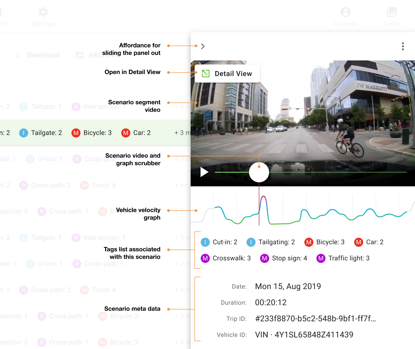
The search results gave users a quick snapshot of matching scenario instances for the selected categories and tags. I designed a master-detail interface that combined the resulting scenarios in a data grid with a scenario detail side panel overlay. The side panel pattern provided users with a quick view of a richer set of data, e.g., video and AV acceleration / deceleration. This pattern also made users more efficient. They could quickly browse to select a candidate for further analysis, avoiding the interaction cost of constant back-and-forth between the data grid overview and the detail view (described further down).
Scenario Detail View
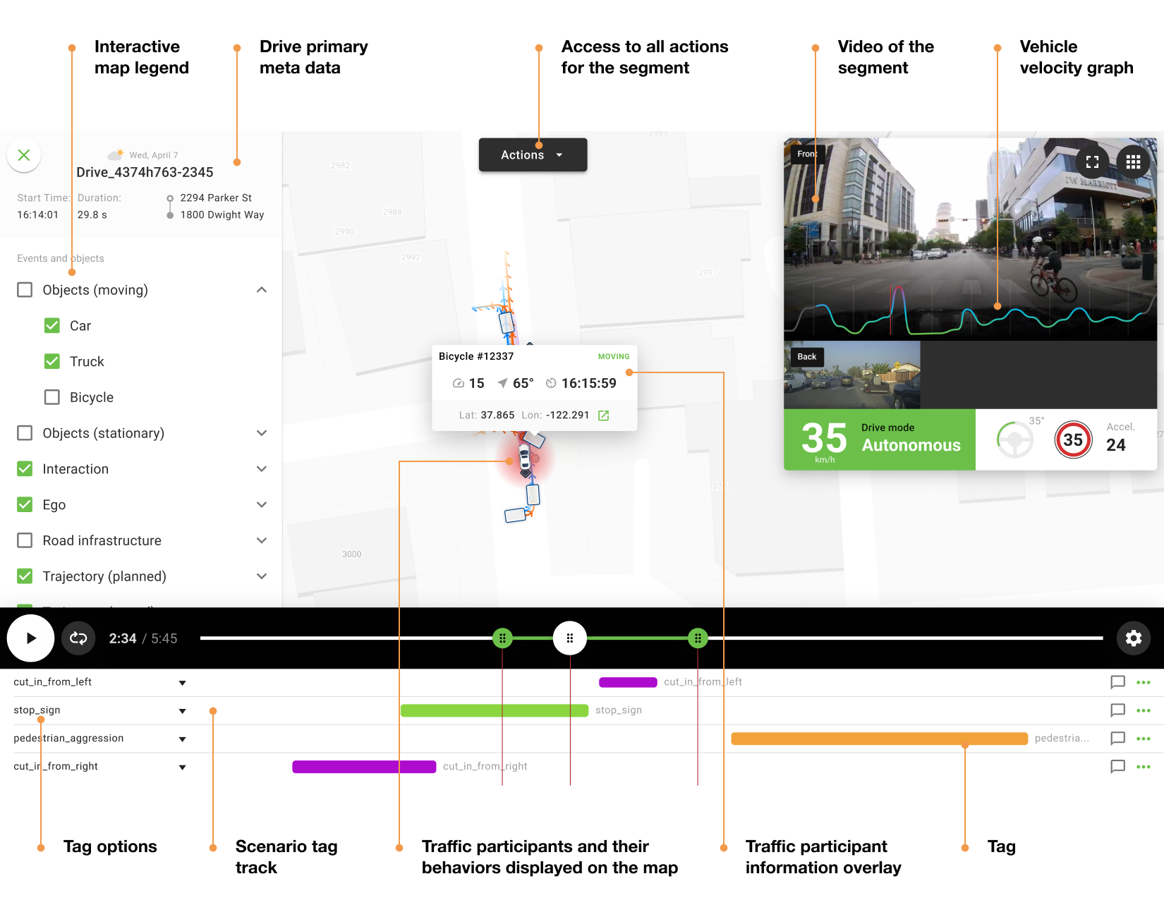
Once the user had identified a match, they could further explore the scenario data within the Scenario Detail View. Under this view, the user was immediately greeted by an interactive timeline of the drive event. A street map was also presented, providing the user with spatial context and allowing them to observe how all the traffic participants (cars, bicycles, trucks, etc.) were interacting with one another within the scene. The accompanying video panel served as a cross-reference to the participants’ behavior displayed interactively on the map. It also served the purpose of increasing users’ immersion into the scene to help facilitate the analysis process. All of this was controlled from the timeline with familiar and easy-to-use controls - play and pause, timeline scrubber, and an option to loop the footage.
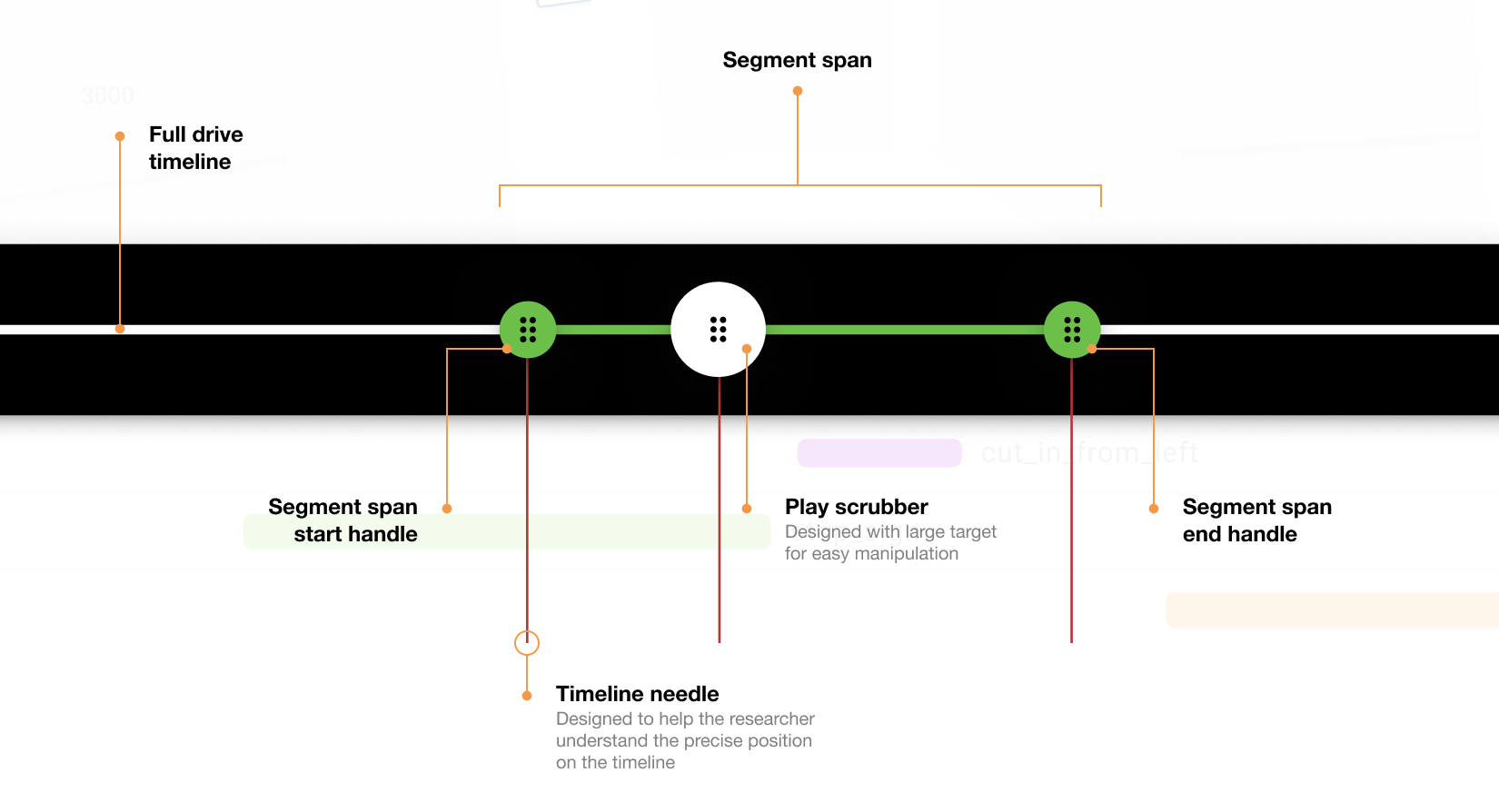
Engineers and analysts would spend a lot of time playing, pausing, and scrubbing through a scene. Therefore, it was imperative to make these tasks as easy as possible. The play controls were intentionally designed with a larger target area to achieve ease of use when grabbing and manipulating them (an example of applying Fitts’s law).
Apart from just conducting analysis, the motion planning and perception engineers had to take several actions on the data. Motion planning engineers needed to extract the scenarios of interest and import them into the training simulation environments. Perception engineers needed to label and train the perception system on instances where it missed or incorrectly classified objects or their behaviors.
Designing for the labeling workflow
My goal was to facilitate this task with an unobtrusive design that feels natural. After identifying a scene candidate for further labeling, the perception engineer could capture the segment, i.e., the start and end time of the scene, and choose from a menu of labeling options.
As the perception engineer identified more and more scenes, Nemo’s UI stored them in a list. I used the shopping cart metaphor and designed a side panel container that presented the list as a stack of cards to the user. Much like an online store checkout, the stack of stored segment cards allowed the engineer to send a single bulk labeling (also known as annotation) request, making the process much more efficient.
Qualitative research through usability testing
Nemo was envisioned as a consumer grade SaaS experience - something that requires little onboarding and has a small learning curve. Therefore, I recruited not only technical (AV engineers) but also non-technical participants for user testing. Non-technical participants had the potential to provide valuable feedback on how intuitive the UI is compared to other modern SaaS experiences.
Each usability session was conducted over Zoom where I presented participants with a high-fidelity ProtoPie prototype of the system and tasks for search and data review. As they were working through the tasks, I was observing and probing certain interactions where they appeared hesitant or unsure how to continue, which allowed me to gain valuable insights into usability issues.
Thematic analysis and usability improvements
After synthesis and thematic analysis of the usability test sessions data, several patterns emerged. One of these patterns was the lack of understanding of how to search with top tier categories.
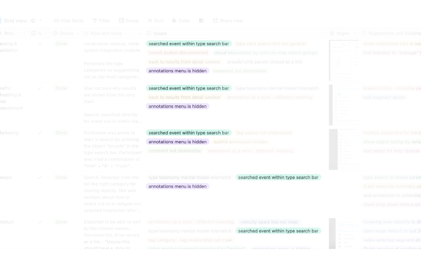
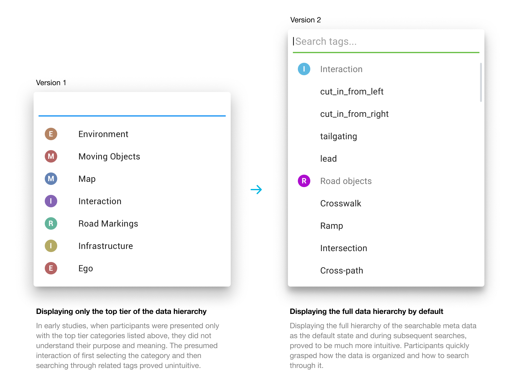
In earlier versions of the prototype, users had to browse or select from a list of top tier categories to begin a query. This proved challenging to grasp by participants in the first round of usability tests. Their inclination was to start the search with keywords of objects and events, instead of top tier categories. Not getting the expected feedback and results from the UI caused a lot of confusion.
Furthermore, after selecting a category, which triggered a query block to appear, participants didn’t understand the connection between the two. This led to them trying to add objects and events within an unrelated category.
Autocomplete keyword search
After observing this multiple times, I designed an autocomplete keyword search that displayed not only a list of potential matches but also their parent categories. The goal of this display was to teach users the underlying structure of the data, helping them understand how the entities relate to one another.
This new search pattern proved very successful in subsequent testing. Participants were not only able to create a proper query but also quickly grasp the underlying structure of the data. This important learning also led to a design revision of the initial search dropdown display. Instead of only showing the top tier categories of the data, which may not yet be part of the researcher’s mental model, I revealed the underlying data hierarchy as well.
Conclusion
Autonomous vehicle and ADAS systems generate vast amounts of data that is multilayered and highly complex. Making sense of this data and identifying critical insights through an intuitive user interface presented many interesting design challenges. By conducting stakeholder interviews, iterating on multiple designs, and creating a highly interactive prototype to facilitate usability testing, I was able to blueprint an effective user interface for advancing the next generation of software-driven vehicles.